Broadband · Reading, Michigan · Project in progress
Great internet starts
with one clear answer.
“Can I get fiber or wireless at my address?” For a rural household or small business, that is the question that matters first. Cloud Radix is building DMCi Broadband’s new website around answering it—and helping the customer take the next step.
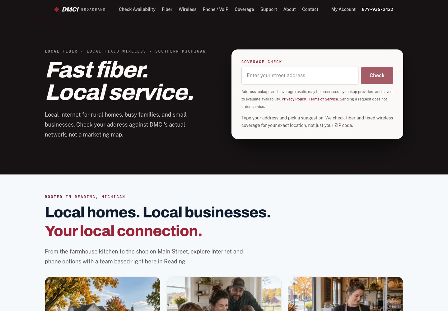
- Client
- DMCi Broadband
- Focus
- Fiber + fixed-wireless acquisition
- Stage
- Website built; launch work underway
The problem
A coverage question should not become a research project.
The project brief identified a gap: customers need a quicker way to find out whether their specific property can receive fiber, fixed wireless, both, or neither. A town name or broad service-area map cannot settle every address-level question.
That uncertainty sits directly between interest and an inquiry. The new experience is designed to make the address the starting point, explain the relevant options, and keep the customer moving without making them work out the network themselves.
For rural properties, accuracy matters as much as speed. An address suggestion identifies a location; it does not prove that an installation is possible.
From interface to connected experience
Choose once.
Keep moving.
A visitor can choose a plan before checking an address. The website remembers that preference, checks eligibility, and carries the plan forward only when the service is available. No hunting for the same plan again. No unavailable service quietly slipping into the request.
This is implemented behavior—not a measured conversion or speed claim.
The customer journey, now connected.
01 / Find the address
Coverage links bring the address field into view and focus it. Selecting a Google Places suggestion starts the check automatically, with progress feedback and duplicate-request prevention. Google identifies the location; DMCi’s records determine listed availability.
02 / Understand the result
Fiber, fixed wireless, dual-service, future-fiber, review-needed, and outside-area results lead to different next steps. A centered satellite map with road labels helps visitors recognize the property.
03 / Compare the right plans
Dual-service addresses get separate Fiber and Fixed Wireless choices. Plans are filtered by service and customer type. An in-page comparison dialog lets visitors choose without opening another tab or losing contact details.
04 / Request, without starting over
Eligible plan choices carry into the request summary. Fiber requests include the underground survey; wireless requests do not. Review requests capture interest without implying confirmed service or an installation appointment.
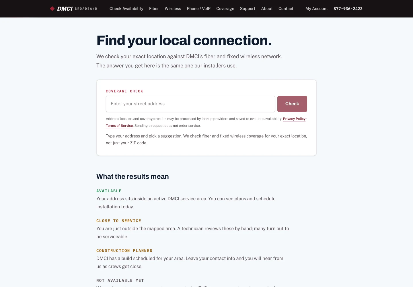
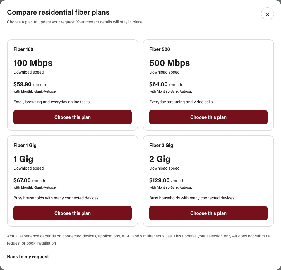
One address. Different paths forward.
| Coverage outcome | Customer’s next step |
|---|---|
| Fiber listed available | Choose a fiber plan and complete the underground survey to request service. |
| Wireless listed available | Choose a wireless plan; no underground fiber survey. |
| Both listed available | Choose the service first, then compare only its relevant plans. |
| Future fiber | Request wireless if available now; future-fiber interest remains separate. No construction-date promise. |
| Michigan address needing review | Request an availability review without installation or payment language. |
| Outside Michigan | Explain that the address is outside the configured service area; no service signup. |
Built so far
A local-first website with a practical purpose.
Automatic address checking
Real address suggestions replace the original demo. Selection triggers a single coverage check, with visible progress, retry support, and separate checks for fiber and wireless records.
Service-first requests
Separate residential and business journeys adapt to what is available. Server-side validation checks the selected service and plan against signed coverage evidence—not just what the browser displays.
Plan comparison without detours
The comparison dialog uses the same filtered plan data as the form. It highlights the current choice, preserves contact details, restores focus on close, and supports Escape, a close button, and backdrop dismissal.
A more useful business journey
Always-visible plan buttons, workplace-specific descriptions, and a remembered plan selection connect business browsing to the address checker. Customers do not need to expand a card to find the next action.
A clearer mobile homepage
Benefits and service-price options appear ahead of the lifestyle gallery. The phone plan dialog uses a full-screen layout with a visible close control, while touch navigation stays tap-based.
Brand consistency and polish
Acumin typography now carries through headings, forms, navigation, and small labels. A restrained looping line beneath desktop navigation replaces the larger animation; reduced-motion preferences are respected.
Navigation that meets the input
Desktop dropdowns support delayed hover opening as well as click and keyboard controls. Coverage links focus the checker, while touch users retain familiar tap-based menus.
Community intent, preserved
The Streaming 101 class button opens an editable, prefilled inquiry about the next class. The general contact form stays blank; asking about a class is not automatic registration.
Website-grounded AI assistance
Ask DMCI’s website knowledge has been refreshed alongside the service pages and result explanations. The assistant supports navigation and understanding; the address checker remains the source of the service-availability result.
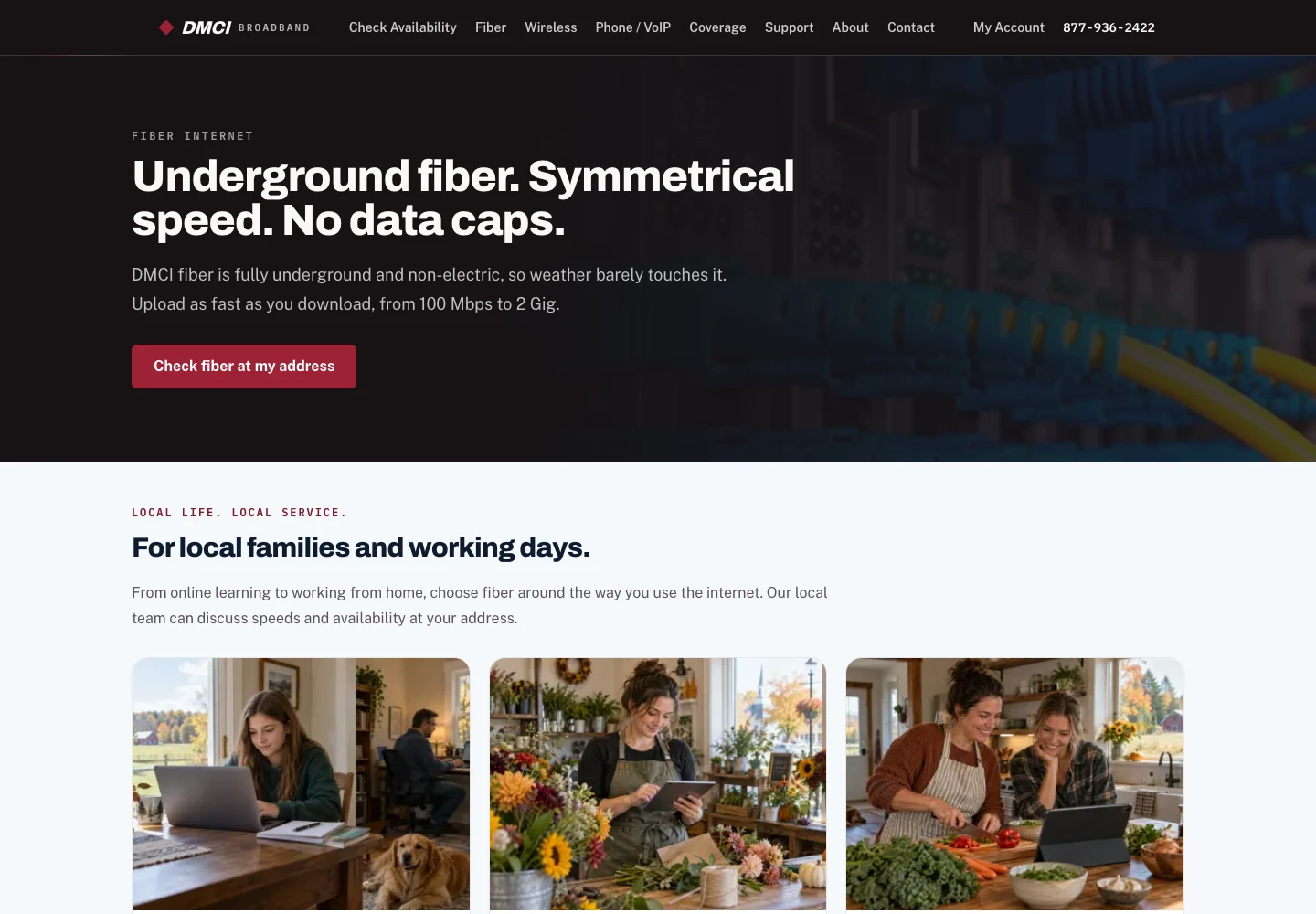
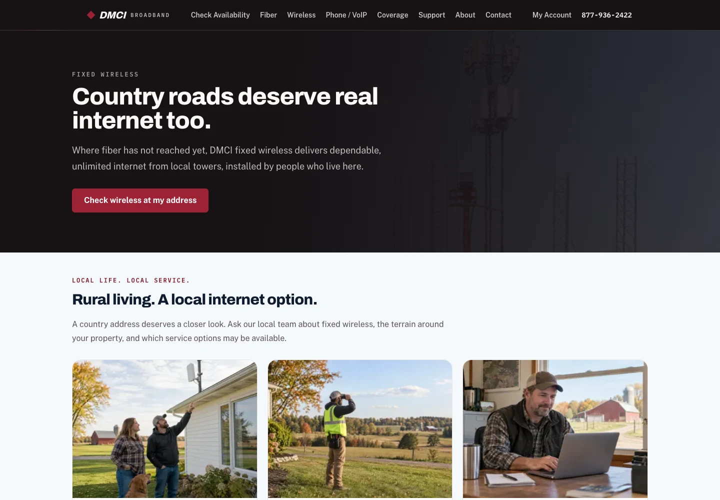
Local homes. Local businesses. A local next step.
The visual direction moves beyond equipment alone. It places connectivity in the context of the people and places it serves: a family at home, a rural property, a small business, and the work of getting connected.
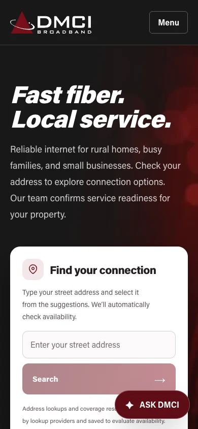
These are real screenshots of the current preview. Some scenes within the website are AI-generated illustrations and labeled as such there; they are not evidence of actual DMCi customers or completed installations.
Protection behind the experience.
The Places integration now has server-held credentials, per-visitor rate limiting, and a shared monthly usage guard. Requests are counted before contacting the provider, and paid lookups stop if the guard is unavailable. Budget notifications complement the usage controls; they are not mistaken for a spending cutoff.
This lets the site accommodate busier days while managing automated-request risk. The public case study does not disclose private account identifiers, keys, or operating thresholds.
Useful context for the local team.
A staff-protected, date-filtered address-lookup export supports coverage review. Request summaries distinguish the chosen service from future-fiber interest. Phone-only contact is supported, email is optional, and survey questions follow the service actually selected.
These are workflow capabilities—not a claim of completed CRM synchronization, live email delivery, or a confirmed installation.
Evidence, not inflated outcomes
Tested across the decisions that matter.
Release checks covered desktop, tablet, and phone layouts; residential and business paths; plan retention and incompatible-plan rejection; changing service without losing contact details; automatic lookup and retry behavior; keyboard navigation; dialog dismissal; and outside-area versus availability-review results. Real provider lookups and controlled test cases were used for different checks. No real customer request was submitted simply to demonstrate this case study.
Built and deployed for review. Launch work remains.
The November review site now connects real address identification, supplied coverage records, plan selection, and service-specific request interfaces. The original demo-only description no longer reflects the work delivered.
Customer-domain DNS cutover, form delivery and email configuration, final client content decisions, and any agreed operational handoffs still need their launch checks. This case study does not claim completed HubSpot/Sonar synchronization. Website requests do not collect payment or reserve installation; staff remain responsible for confirmation and scheduling.
The next measurement stage is inquiry completion, manual-review outcomes, time to a useful answer, and qualified requests progressing toward installation. No conversion lift, revenue increase, or achieved response-time guarantee is asserted.
What question stands between your customer and a sale?
A better website does more than describe a business. It helps people make the next decision—and gives the team a useful place to pick up the conversation.
Build a clearer customer journey →